Skip links
airtek logo branding page

Brand Identity - Case Study - AirTek Aerial Imaging

My Role

Tools

Timeline

Motion Graphic Designer

Web Developer

Dec 2021 – January 2022

Project Overview

Transforming AirTek Aerial Imaging into a standout brand was more than just a name change—it was about creating a visual identity that reflected their expertise and values. Specializing in drone photography and videography, AirTek serves diverse sectors such as real estate, construction, and industrial marketing, as well as capturing special moments like aerial wedding photography. Their mission? To deliver a clean, modern, and energized brand that’s as versatile as their services. By crafting a strong, recognizable identity, we ensured AirTek stood out in competitive industries while remaining true to their core values.

Project Goals

How do you take a good brand and make it exceptional? AirTek needed more than just a refreshed look—they required a complete overhaul of their brand to align with their aerial services and technical expertise. The objectives were clear:

  • Design a logo and visual identity that instantly communicates their focus on aerial imaging and technology.
  • Establish a modern and professional tone that appeals to industries like real estate and construction.
  • Create a unique, SEO-friendly name to replace “Flyby,” resolving trademark challenges and confusion in crowded markets.
  • Develop an iconic symbol and cohesive typography to distinguish AirTek across both digital and traditional platforms.

Every step of the rebranding process was designed to resonate with their audience, build trust, and improve visibility. The result? A refined identity that makes a lasting impact.

The Verbal Brand Identity

To reflect AirTek’s core values and key offerings, we crafted a concise, professional company description:

“AirTek Aerial Imaging specializes in delivering high-quality, reliable aerial photography and videography services across diverse sectors, all at competitive prices. With a price matching guarantee, we ensure our clients receive the best value for their investments. Known for being professional, local, licensed, and cost-effective, AirTek takes pride in being the go-to partner for all your aerial imaging needs.”

This description showcases the company’s commitment to quality, reliability, and customer satisfaction, all while maintaining a professional and approachable tone.

Visual Elements

Creating the Visual Brand Identity:

The visuals for AirTek were intentionally crafted to reflect the company’s cutting-edge services and professional image. Here’s how each component came together:

Logo Design

A sleek and modern design featuring a custom drone icon seamlessly integrated into the typography, providing an instant visual connection to aerial imaging and technology.

Colors

A palette of sky blue tones, inspired by the open skies, paired with contemporary technology-inspired hues to convey innovation and freshness.

Typography

Clean, technical fonts were selected to reflect professionalism and ensure readability across all mediums.

Iconic Symbol

A custom-designed drone graphic in motion became the centerpiece of the brand. Versatile enough to be used on marketing collateral, the symbol sets AirTek apart in competitive markets.

The result is a cohesive visual identity that represents AirTek’s professionalism, innovation, and technical expertise at a glance.

Design Evolution

The design process evolved over six distinct stages, from sketching bold ideas to incorporating the finer details that brought AirTek’s visual identity to life.

INITIAL DRAFT

The early concept blended a drone into rounded, smooth typography, aiming to seamlessly merge the lettering with the drone’s frame.
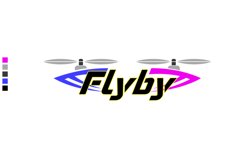
CONCEPT 1

We experimented with drone-inspired lettering but found it distracted from the brand’s name and failed to convey the technical expertise expected from an aerial imaging company.
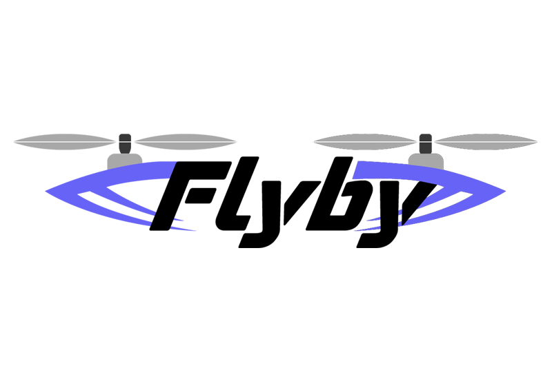
CONCEPT 2

Adjustments to the lettering height and frame gave the design a more connected, integrated feel. These refinements added balance and highlighted both the text and the service nature of the brand.
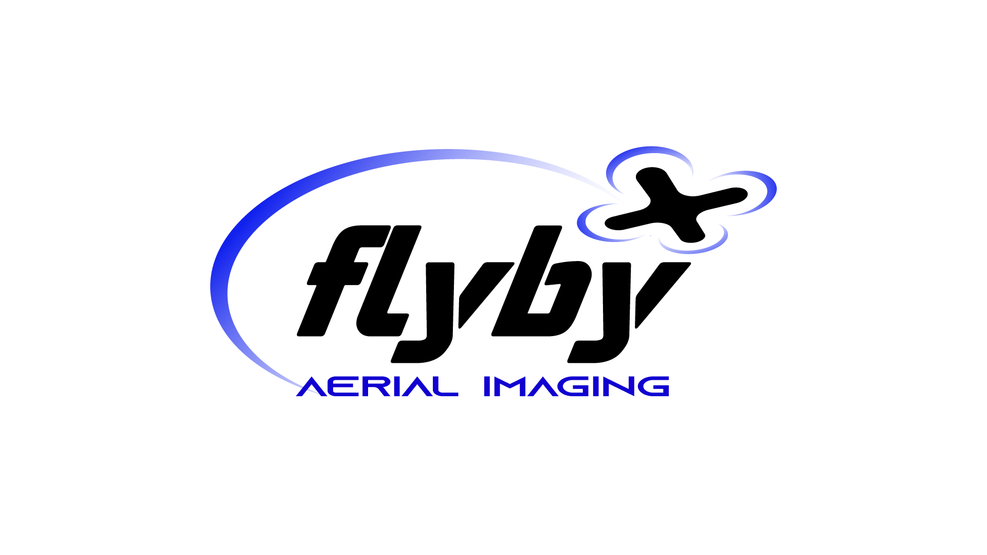
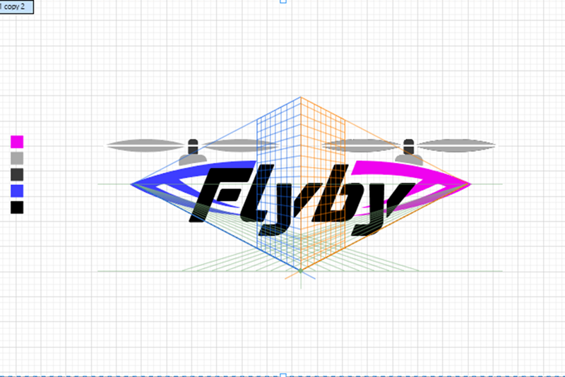
CONCEPT 3

The gradient swoosh added an energetic motion effect. However, we increased the drone’s detail and fine-tuned the initials to enhance the logo’s clarity and alignment with the brand’s personality.
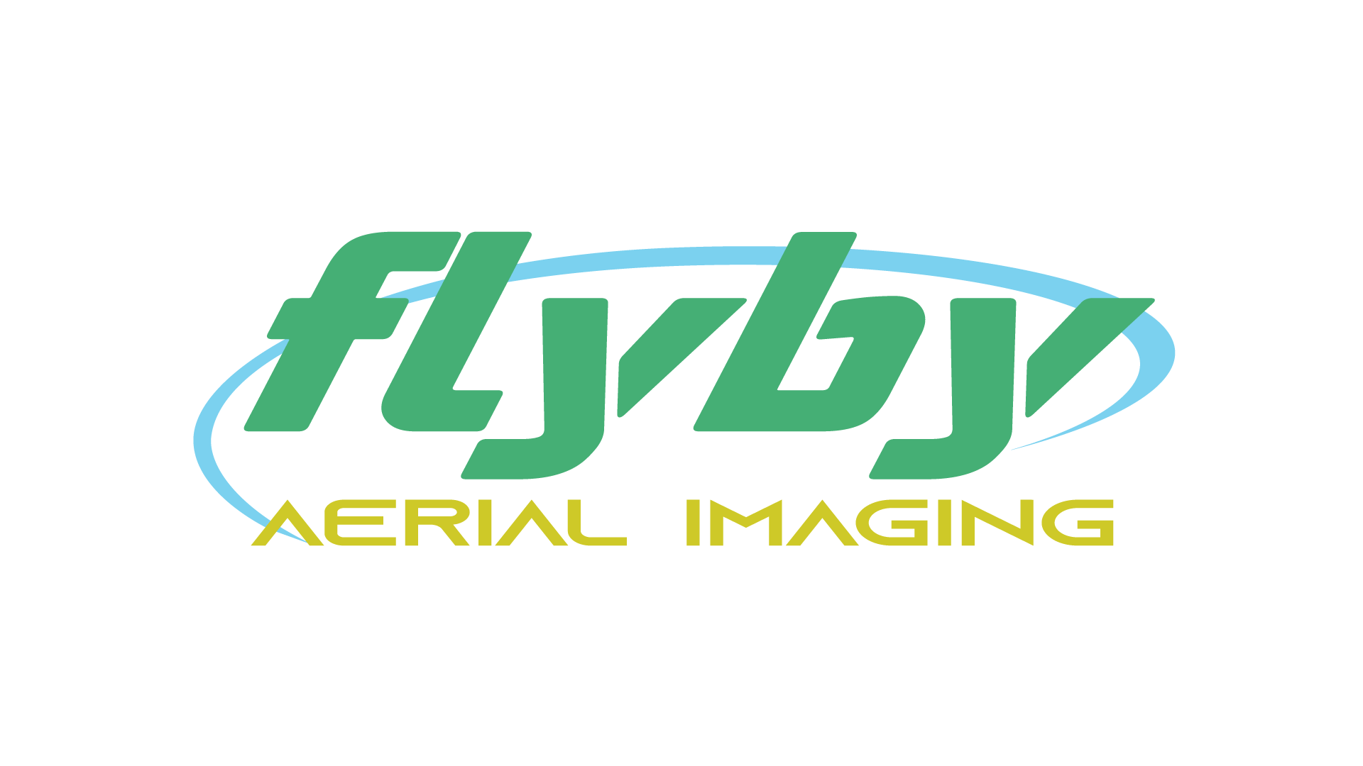
CONCEPT 4

Final tweaks included lengthening the swoosh to encircle the typography, achieving a dynamic sense of motion. The lettering’s streamlined height created a clean and professional final design.
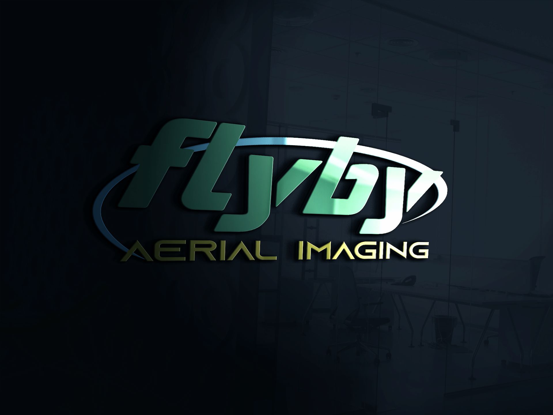
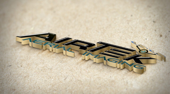
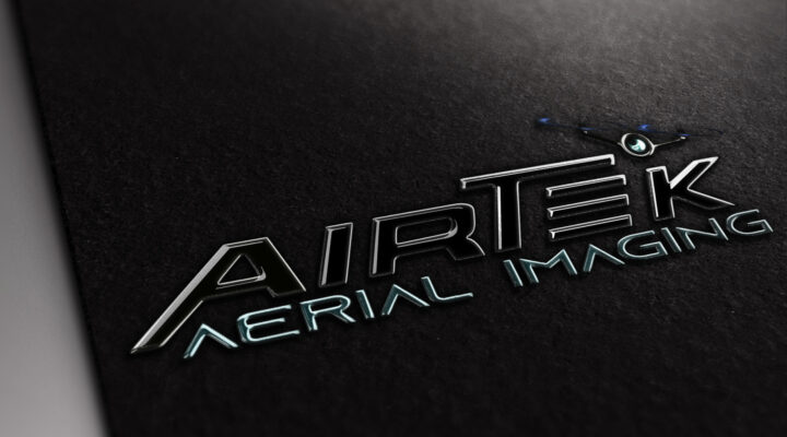
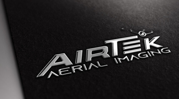
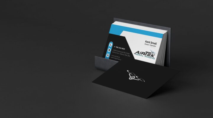
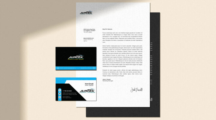
Flyby Mockup Reflection

MOCKUP 1

3D branding visualizations showcased the logo on a black, reflective surface to represent how it would look on materials such as business cards, storefronts, and company vehicles. Bright, contrasting colors added an eye-catching polish.

Branding Impact

The Problem

"Houston, we have a problem"

Operating as “Flyby,” the company encountered several challenges, ranging from SEO limitations to potential trademark issues. The name was already widely used in related industries, resulting in brand confusion and making it difficult for the business to stand out. To address these challenges, we guided the client toward a new identity that would elevate their brand and set them apart.

Our Solution

"Every ending is just an opening act for something greater."

We introduced the new name, AirTek, which captures both the company’s aerial services and technical expertise. The name highlights their core offerings while resolving the limitations of their former identity.

The branding groundwork established during the initial stages of “Flyby” allowed for a smooth transition. We built upon the existing framework, refining elements like:

  • Typography and style for a professional yet modern look.
  • Technology-inspired colors that create a fresh and innovative image.
  • A new iconic drone symbol that seamlessly integrates with the updated brand.

Together, these updates gave AirTek a distinctive identity and significantly strengthened their market positioning. The client was thrilled with the new name and accompanying visual brand, which have since helped elevate AirTek’s reputation and visibility in industrial and commercial sectors.

The good news was a lot of the legwork for the branding was already completed in the initial development stages of Flyby. We had the basics of our new logo already completed:

  • The typography
  • The style of the new logo
  • The colors which represented technology 

The client asked me to develop a small iconic symbol that could easily represent this brand. I quickly went to work to develop a unique drone to use as an iconic symbol and then incorporated this symbol into the brand.

Final Thoughts

AirTek Aerial Imaging now stands as a brand showcasing professionalism, reliability, and technical expertise. With a distinctive name, modern logo, and cohesive branding elements, the rebrand ensures they not only meet but exceed the expectations of real estate developers, industrial businesses, and marketing professionals. Their message is clear, their look is sharp, and their promise is strong.

Additional Case Studies

Project 2

Case Study | AirTek Aerial Imaging - Drone Mapping & Videography

Brand Identity, Full Website Development, Print Media, Digital Marketing, Social Media Development, Video Editing & Development

Project 2

Case Study | AirTek Aerial Imaging - Drone Mapping & Videography

Brand Identity, Full Website Development, Print Media, Digital Marketing, Social Media Development, Video Editing & Development

Project 3

Case Study | Baby Best Buy

Brand Identity, Full Website Development, Print Media, Digital Marketing, Social Media Development, Facebook Ad Campaign, Video Editing & Development

This website uses cookies to improve your web experience.
Explore
Drag