
Web Design - Case Study - AirTek Aerial Imaging
My Role
Tools
Timeline
Motion Graphic Designer
Website Developer
January 2021 – March 2022
Introduction
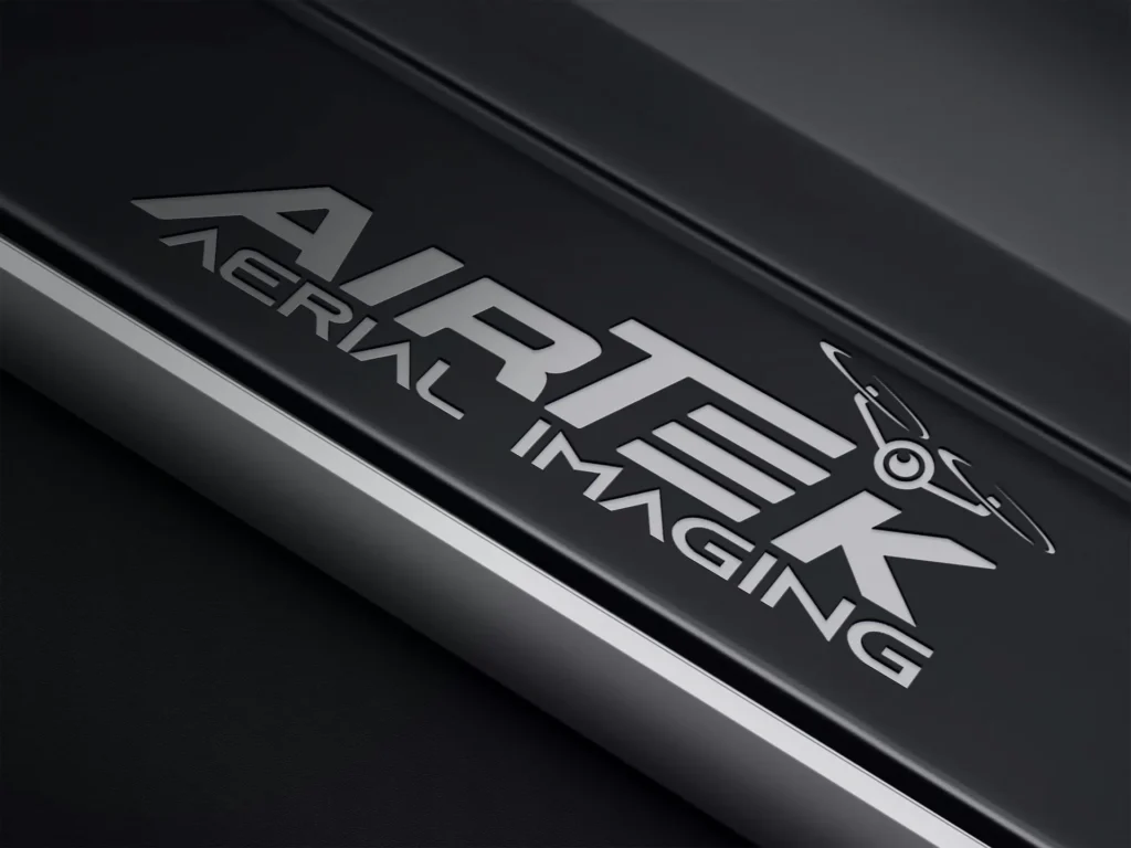
After establishing the brand identity for this new Aerial Drone company. AirTek was ready to take its place on the world stage. A brand-new website built from scratch was my next challenge.
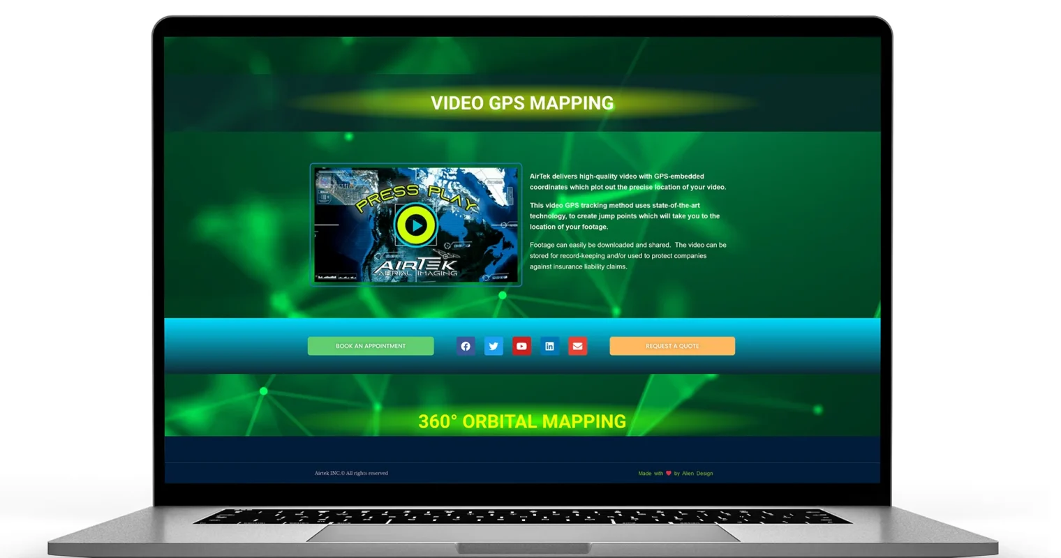
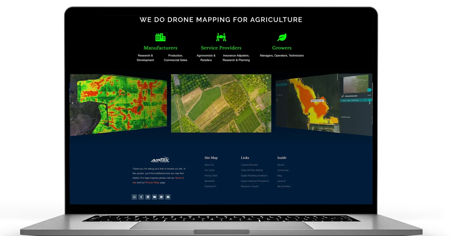
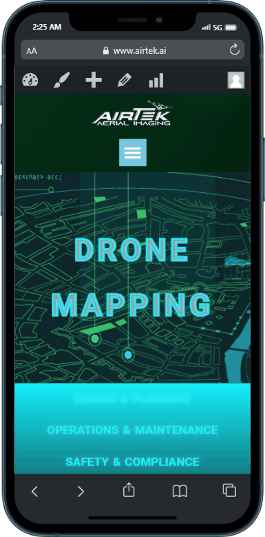
Airtek offers a wide range of unique services; each service was visually different than the rest which required a different brochure, which would be displayed at tradeshow events. It’s better to look at the AirTek’s website as a series of independant landing pages combined; each page each with it’s own style and color scheme.
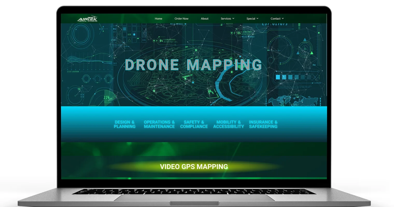
I have decided to choose the Drone Mapping page as the focus for this case study. For confidentiality reasons, I have omitted the actual values, site analytics, and metrics.
I had many challenges along this journey my deadline was to solve the problems below within three months and launch this new website. The results were outstanding.
My Role
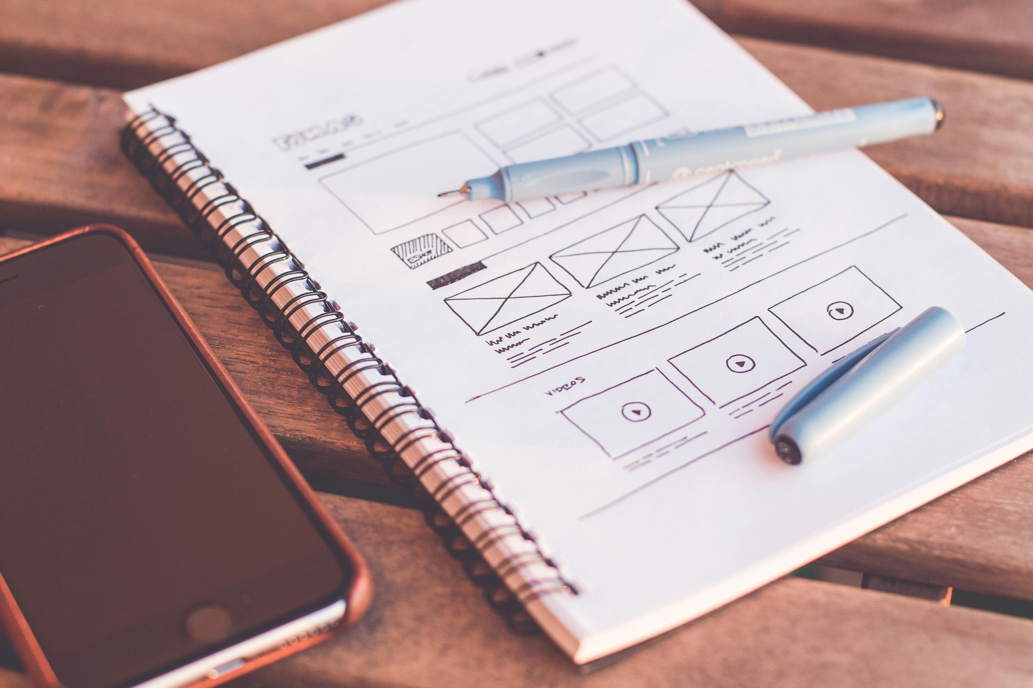
As a Freelance Web Designer, and as an experienced Motion Graphic Designer, I was well suited to take on this project without any outside help. For this project I had to wear many hats; content writing, research and development; graphic design, video development; sound editing, as well as designing an easy to navigate interface to streamline the user experience.
Challenges
Problem #1
Breaking Into The Market
A handful of well-established aerial drone companies dominated the market share within our region and in each respective industry; commercial, industrial and agricultural. How can AirTek get the attention of our future prospects and stand out amongst the competition?
Solution #1
Upgrading Their Process Was Key
Many of the systems and technology these companies were using was outdated. Our goal was to showcase new innovative technologies, and upgrade them to a new system, superior to their current technology. This would be AirTek’s unique advantage over the competition.
Problem #2
Too Much Information and Not Enough Space
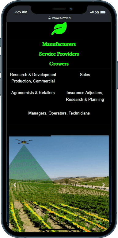
Through my research, I discovered that the more successful companies within the industry kept the pages short and to the point. The information had to be concise, easy to understand because the majority of visitors would likely be tradespeople, in their forties and up. The website needed to be easy to navigate by all age groups.
Solution #2
Visual Communications Was The Answer
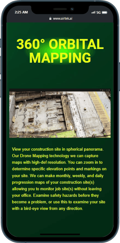
The solution was to represent the material visually, rather than by text. This way the information can not only be understood easier regardless of age or location but it also transcends language barriers. Understanding that the majority of our visitors will be viewing AirTek’s website on a mobile device, this methodology allowed me to save a great deal of space.
Problem #3
Introducing New Technology To Our Demographic
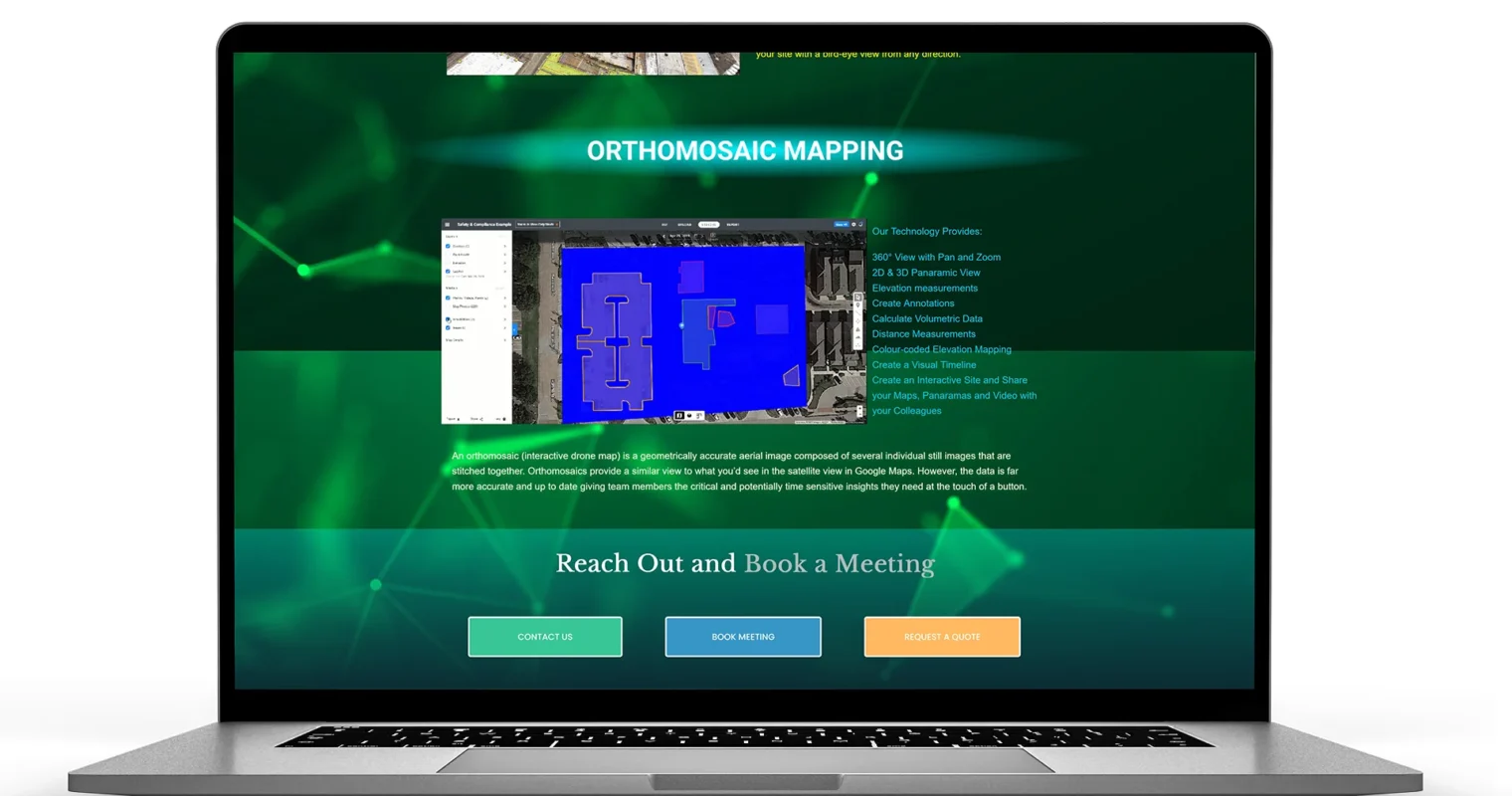
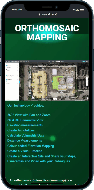
AirTek offered technology that was new to the Canadian Demographic called ‘orthomosaic mapping.’ The process comprised of taking a series of images across any given plain, stitching the images together across two separate completed flight paths, to create a three-dimensional map. This was too complicated to showcase, and required too much explanation to be on the Drone Mapping page. This was a main selling feature and needed to be showcased without confusing the viewer.
Solution #3
We Created An Interactive Experience
Instead of explaining the process, I decided to create an interactive three-dimensional model; this allowed the user to spin the model, apply layers, such as thermal and grading metrics, this allowed the user to get a feel and understanding of how this technology worked as well as provide a visual representation that was easy to understand. This eliminated several paragraphs of text which would have been omitted on the mobile website due to size, and the space required.
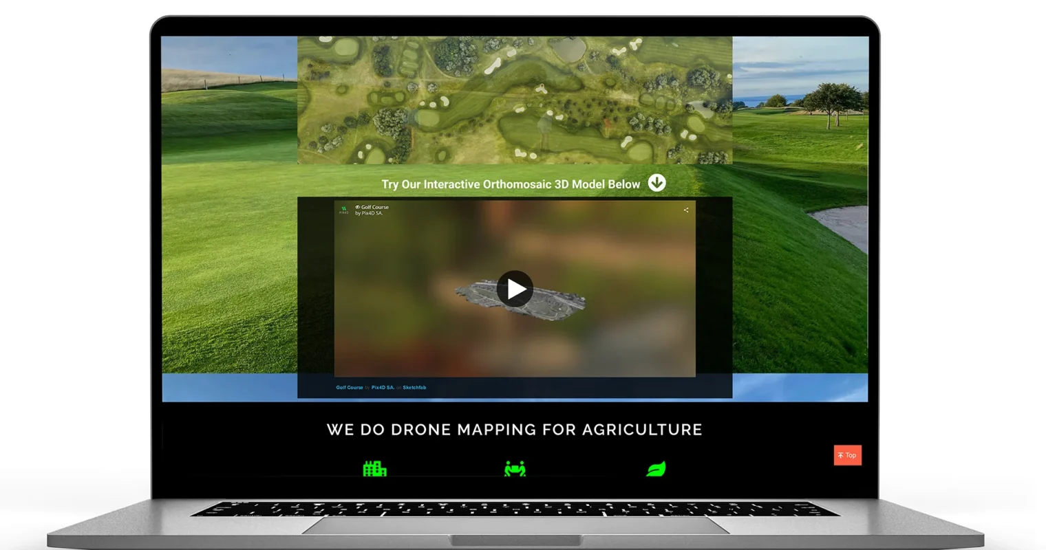
The Result
Here's The Interactive Three-dimensional Model Created on Pix4D
Golf Course by Pix4D SA. on Sketchfab
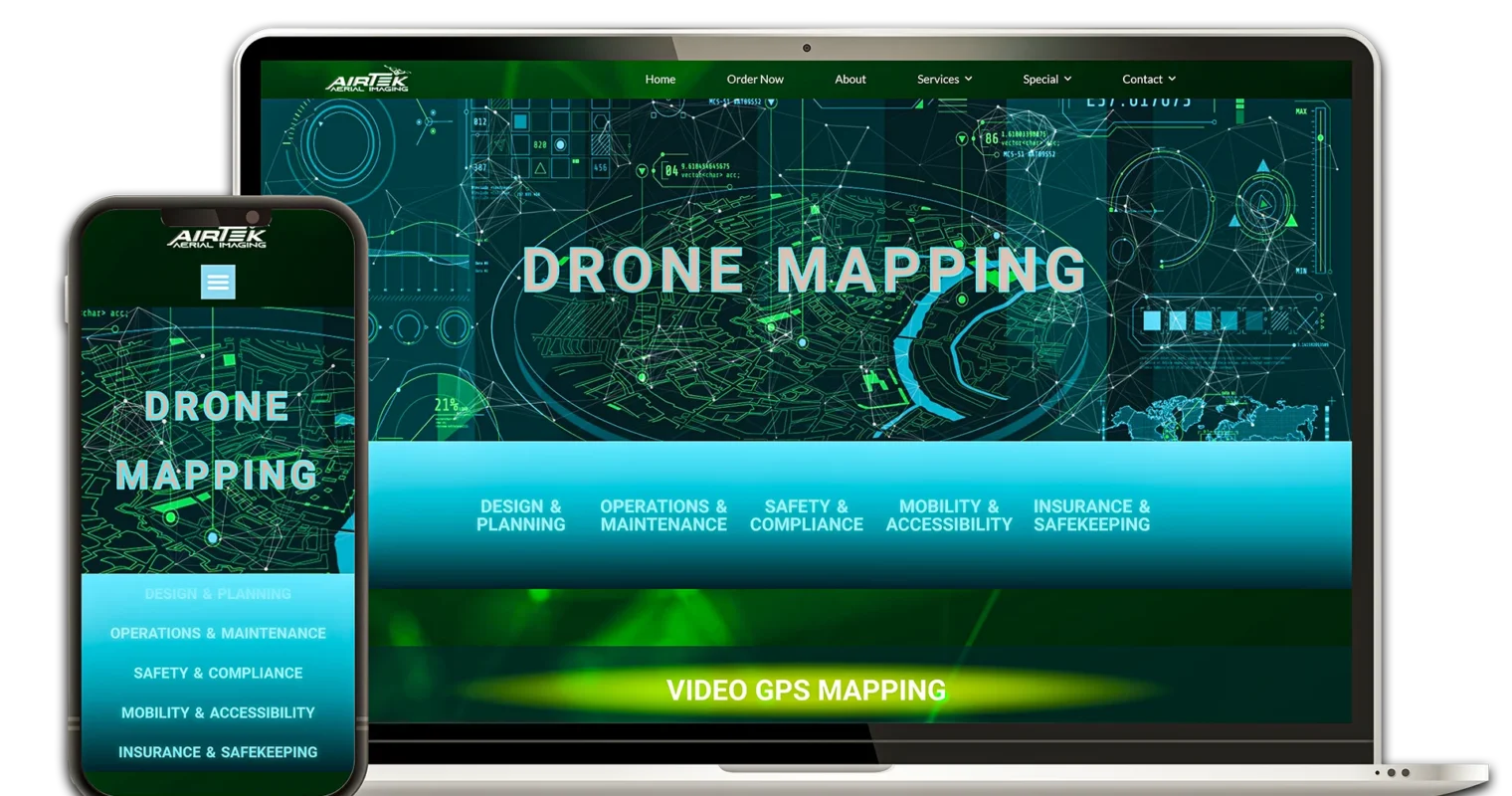
Visual Design Elements
The Drone Mapping page was designed to emulate the feel and flow of technology and innovation. I chose several shades of grey smooth gradients to represent a metallic finish across the main title. Bright contrasting colours were overlayed with yellow and green to give it a digital feel which blended in nicely with the highlights in the background.
Goals
Communicate AirTek’s Value Proposition
Provide a clear message that AirTek’s innovative technology will save companies in the construction industry significant time and money as well as improve safety and efficiency, with a design that’s simple and easy to navigate for ages, forty and up.
Display the Information to Read like a Digital Brochure
Today, over 90% of our users will be out in the field, many are less likely to view our website at home or at the office, the information must walk the visitor through the features and benefits, on a mobile device, capitalizing on the key selling points that will capture the visitor’s attention.
Drive Visitors to Book an Appointment
Our goal is to have a 5% conversion rate from visitors to potential buyers interested in acquiring more information. The website must have many links and call-to-action buttons to help lead our visitors through our qualified sales channels.
Additional Case Studies
Branding
Logo design
Custom Print
Case Study | AirTek Aerial Imaging | Branding
Brand Identity, Logo Design, Business Plan Consultation, Print Media, Digital Marketing, Social Media Development, Video Editing & Development
Explore the step-by-step journey of developing AirTek Aerial Imaging's brand identity from the ground up. This case study dives into every stage of the process—from initial concepts and brainstorming to final design execution. Learn about the research, strategy, and creative decisions that go into crafting a brand identity that truly reflects a company’s vision and values.
The design process for creating brochures and business cards in this case study involved a thoughtful blend of strategy, creativity, and precision. It began with understanding the brand's identity and objectives to ensure the designs effectively reflected its core values.
This case study includes the digital marketing strategies and motion graphic design which came together to create an engaging and dynamic user experience. From concept to execution, this section highlights the steps taken to ensure the website not only captured the client’s vision but also resonated with their target audience..